Lakeside Physiotherapy
Traditional Layout
With some businesses, you want to be happy in the knowledge that they are a long-established company with traditional values. Lakeside Physiotherapy Clinic is a business that needed to appear in this traditional manner.
When creating this website, our designer decided to use a 3-column layout, separating each design element based on 3 columns. The layout is popular amount many templating systems and was therefore used often. However most modern websites try to avoid using the traditional layout. By utilising this layout, we created a website that holds established authority mixed with modern design aspects.

Creative Design
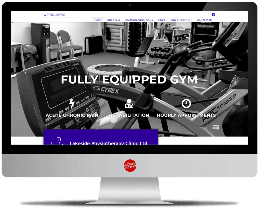
Because of Lakeside’s layout, our designer wanted to add some innovative design aspects to ensure the website was not seen as aged. The main idea was to overlap certain sections of content to add depth to the website’s structure. The overlapping sections were placed over the top of images, and a background colour was added. For example, a blue text box overlaps the homepage slider.
Animations such as parallax has been used in certain sections to give the website a modern appeal. The grids all contain a hover state, zooming out the image. A sticky header has been used for simple navigation between webpages.
Successful Branding
It’s always important to make sure your brand is visible throughout your website. By subtly placing your logo and using a specific colour scheme throughout your web presence you will increase brand awareness and build your brand’s image.
For Lakeside, we stuck to using blue, grey and white for their business’ colour scheme. Their logo has been strategically placed in the background of certain sections in a faded out grey colour. We’ve also made sure to fade out the images used within the page titles so they reflect the lakeside blue.

