The Logo Design Process
Your Brand Identity
Designing a logo is an extremely important aspect of branding. Therefore it’s important that you follow a professional logo design process. It’s more than just creating a pretty picture, and it should communicate more than just your company’s name. With fantastic branding, your company will be recognisable and memorable to customers.
Using your company logo effectively can make you stand out from your competitors. A high quality logo will reflect that you are a trustworthy business.
At The Capture Factory, we believe that you should use your logo everywhere. Your company’s logo should work across all your communication: website, packaging, signage, brochures, stationary etc. If your brand identity is consistent, your potential customers will see your logo frequently and therefore are more likely to remember it.
Read on to find out more about The Capture Factory’s professional logo design process.




Building Your Brand
The Capture Factory will work with you to discover and develop your company’s brand. We will establish an identity you’ll be proud. The most effective branding is built upon a strong idea…
When we’re designing the logo, we’ll challenge you to think about:
- your company’s mission
- your company’s values
- what your customers expect from you
- what qualities you’d like associated with your company
Once we have all this information, we will start defining your style and developing a unique company logo.
Our head designer, Rhys, will have this discussion with you before producing a storyboard of ideas for your logo. Once this storyboard has been created, you will then choose your favourite design. Rhys will develop your chosen design until you are completely happy with the final outcome. Deciding upon what type of logo you want is a huge part of the decision.
At The Capture Factory, we follow a professional logo design process.




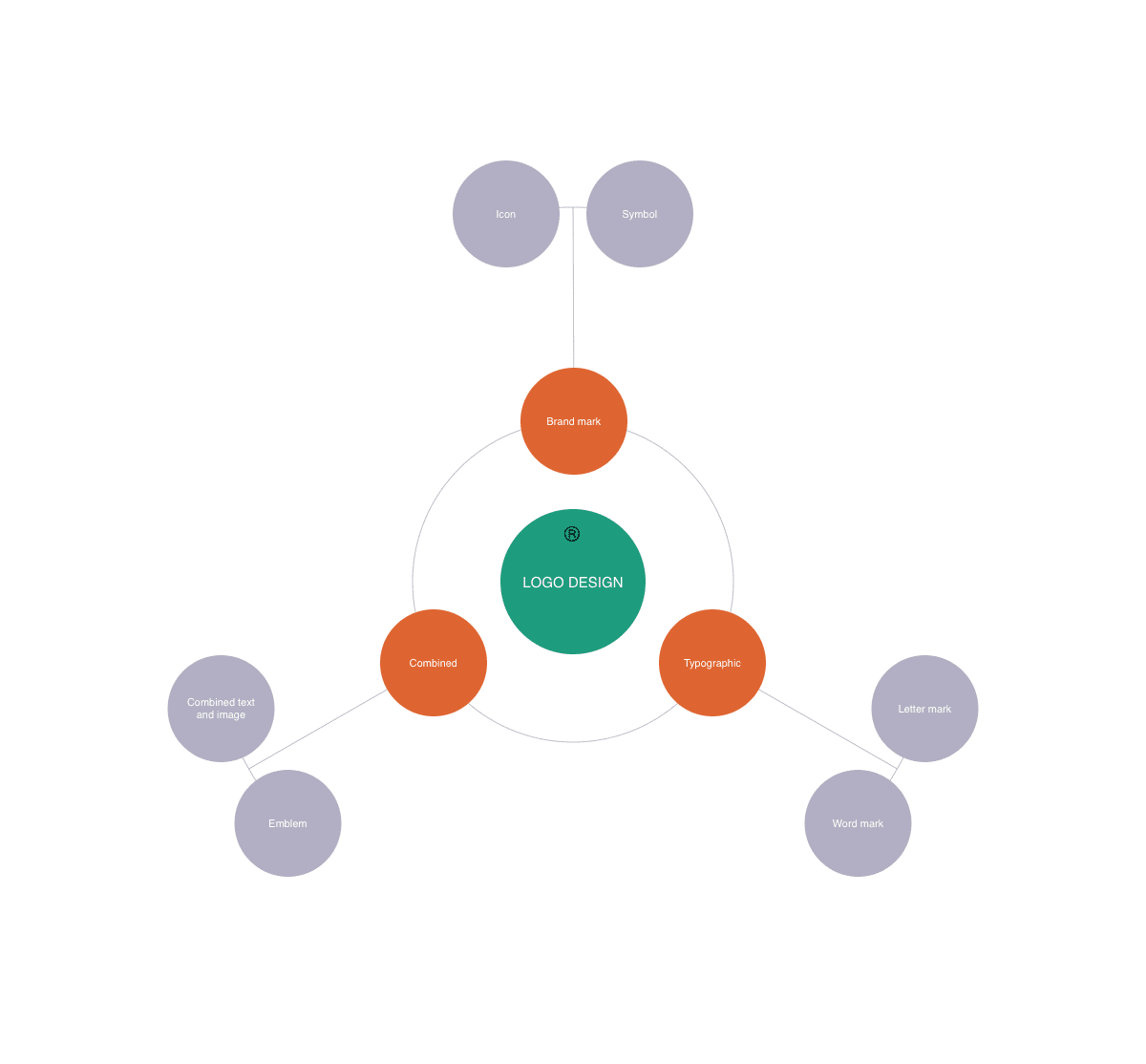
Stage 1
Brand Mark: An image will be used with no letters involved, it will be purely pictorial with no written word.
Typographic: The logo will be created using typography (letters). No images will be used within the piece, creating a logo purely from styling graphemes.
Combined: Using a combination of both text and image that work together to create a logo.
Stage 2
Icon: A pictorial representation of a visible product. The graphic is similar to the actual, real product. An icon is restricted to the physical object therefore can be easily understood.
Symbol: The graphic can represent products or ideas, including concepts and feelings. The viewer uses association to figure out what it stands for e.g. Dove is peace.
Letter Mark: The initials of the company are used but no words are actually formed. A letter mark is the height of simplicity, can is generally used for organisations with hard to pronounce/long names.
Word Mark: Complete words are used within the logo, whether it’s one word or multiple. These are used for companies with distinctive name. A word mark is a good choice for smaller companies who are getting their feet on ground as it clearly communicates the name.
Combined Text and Image: Using the best of both worlds, letters and images are used side-by-side to make the logo. The text spells out the name of the company while incorporating a visual icon. These are more complex but it gives companies the freedom to use either symbol or text independently.
Emblem: The text is placed inside the symbol so the two are inseparable. An emblem resembles an official badge or seal and is good for government or political organisations. An example is Starbucks.
